

Following our brief introduction to the history of the Periodic Law and its translation into a table, we would like to remind you now that elements and their relationships can be showcased in many different ways.
The truth is that Mendeleev’s periodic table is artificially split into rows instead of being a continuum, even though the series of elements is in fact linear. Moreover, obvious gaps have been inserted at the top of the table; that is, H/He, Be/B, and Mg/Al should be closer in space. This was done so that the middle rows would clearly show a period of 18, in detriment of the period of 8 occurring before it and that of 32 occurring after it. Therefore, the standard periodic table does not represent the actual linearity of the elemental properties, hence the efforts some have put into devising other (more accurate) forms of the same element order.
We will now show you some of our favorite alternative arrangements.
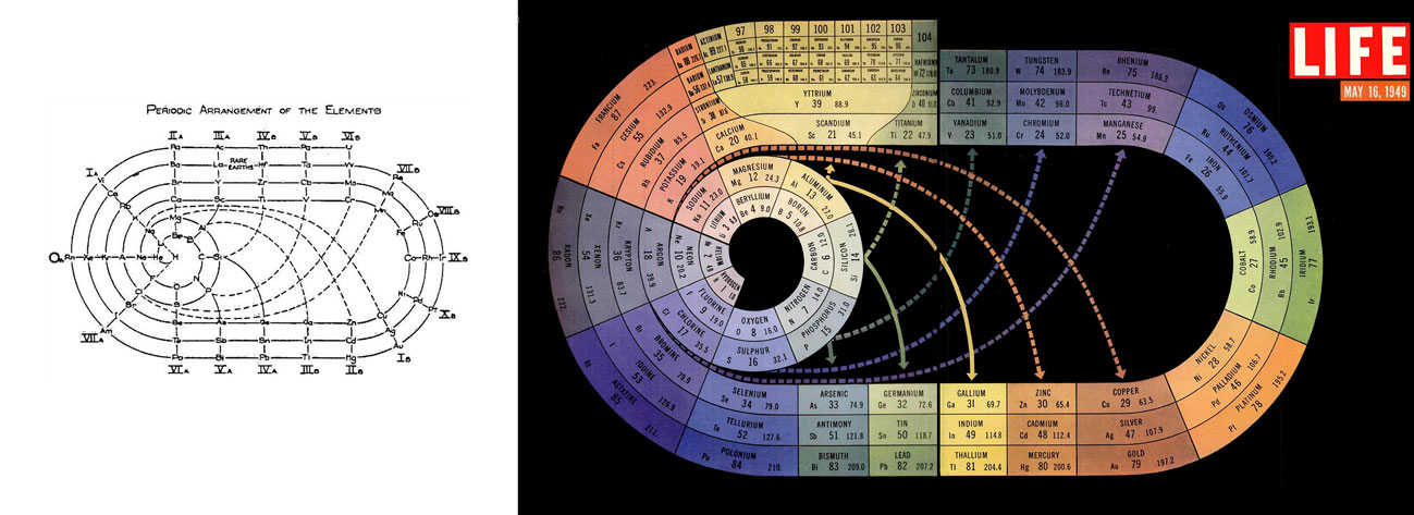
The Race-Track Periodic Table (1933)
Chemist and sci-fi author John Clark created a race-track-like table in 1933 (left), whose nicely colored version became popular after LIFE magazine’s issue on The Atom in 1945 (right). This irregular spiral is a systematic arrangement of the natural elements (further extended to element 104) by their number of electrons. The table is so neat that elements with similar properties appear grouped together in blocks or connected by solid arrows (see for example the inert gases on the left).
Click to enlarge
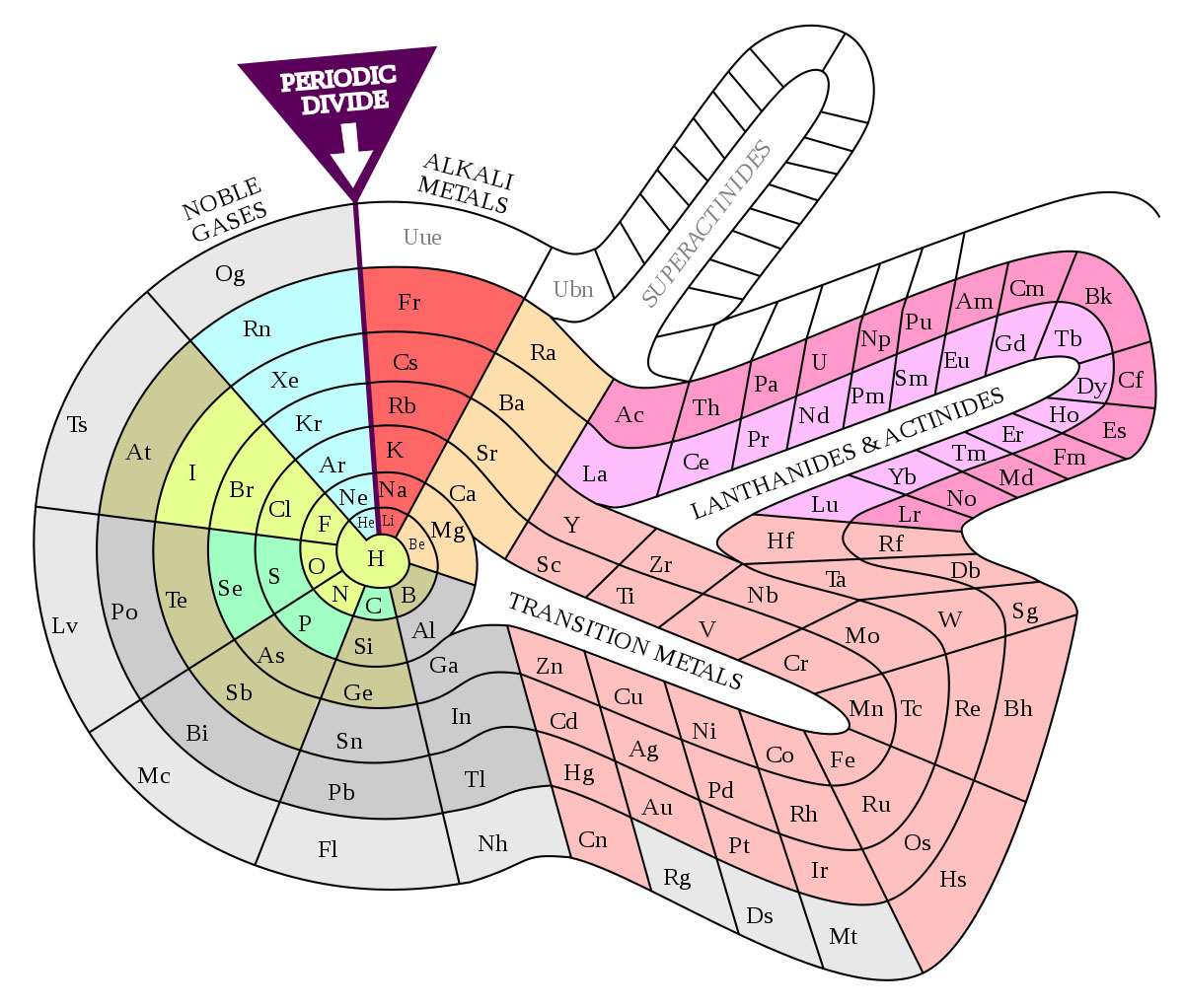
The Spiral Periodic Table (1960)
Similar to the previous one, but with more of a snail shape, Theodor Benfey proposed this periodic table in the early 1960s, which also emphasizes the continuity of the elements rather than imposing artificial breaks (shown as “Periodic divide” in the image). As such, it illustrates more dramatically the different periods of 8, 18, and 32, while also allowing for the introduction of new elements (superactinides).
(DePiep/Wikimedia/CC-BY-3.0)
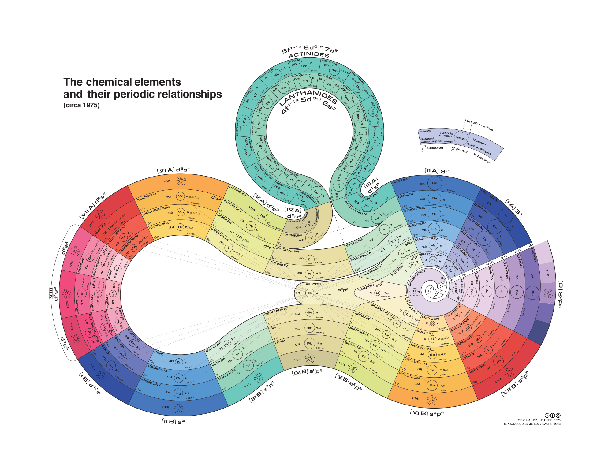
The Curled-Ribbon Periodic Table (1975)
This one is particularly good-looking, although probably not that practical for everyday use. It was created in 1975 by organosilicon chemist James F. Hyde, although we are here showing the reproduction made by J. Sachs in 2016. Hyde’s point of view is obvious as silicon is featured right in the middle (between the two circles), showing also the connections of this element to many others in the graph (dashed lines). The list still begins with hydrogen (center of the main circle), before spiraling out into the different groups. The different colors also highlight the elements’ periodic relationships.
(Rezmason/Wikimedia/CC-BY-3.0)
The Adomah Periodic Table (2006)
Also referred to as the “Perfect Periodic Table” by its designer, Valery Tsimmerman. The idea derives from a previous table by Charles Janet, who arranged the elements according to their electronic configuration in his Left-Step Periodic Table (1928). Instead, the Adomah system is set around the four quantum numbers of the electron configuration.
Two of the four quantum numbers (n and l) are reflected in the traditional periodic table. However, only the first three periods follow quantum number n. After that, the pattern breaks. The main blocks of the traditional periodic table (i.e., the s, f, d, and p blocks) are in fact presented in the order l = 0, 3, 2, 1, highlighting that this arrangement is indeed illogical. Of note, elements H and He are placed in two different positions to reflect their dual nature in terms of atomic structure and chemical properties.
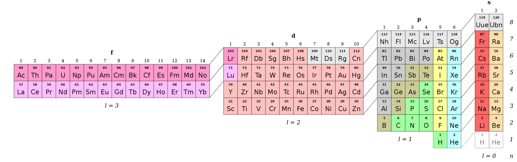
(Ch1902/Wikimedia/CC-BY-SA-3.0)
The Periodic Table of Element Scarcity (2018)
Well, this one is clearly based on the most traditional arrangement, but it is actually giving out completely different information. This is a periodic table with a purpose!
The European Chemical Society (EuChemS) has designed this table to make people reflect (and hopefully act) on the issue of element scarcity. The 90 natural elements that make up everything (literally!) have been drawn so that the area occupied by each element gives an indication of the amount of that element in the earth’s crust and atmosphere. In particular, it indicates the elements used in a smartphone (around 30!), over half of which may be in limited supply in the coming years. This is to show that we are consuming some elements very fast and their availability may become an issue unless we find ways to recycle them.
Of note is helium, the only element that is truly “lost into space”, since it is so light that escapes the planet’s gravity.
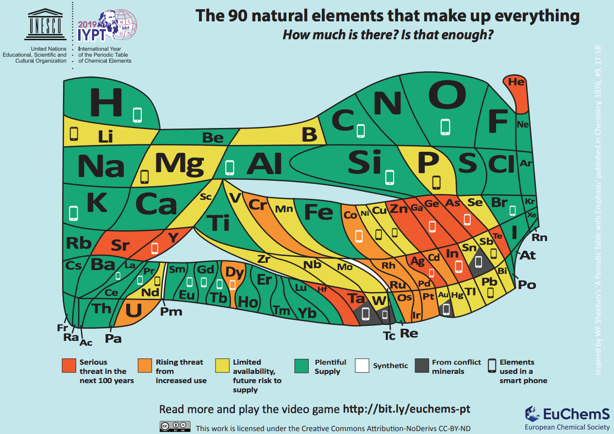
Click to enlarge
The Periodic Table of Chemical Bonds (2019)
This one we owe to mathematicians at the Max Plank Institute, who investigated almost 5000 substances containing two elements in different proportions. Each circle in this hypergraph represents the bonding an element establishes with an organic residue. The bonds are then ordered by their polarizability (where more polarized bonds place the element higher in the graph). Here, two elements can be compared either through a direct arrow (e.g., the bonds of hydrogen, for example, are more polarized than those of boron) or by the chain of arrows between them (e.g., the oxygen bonds are more polarized than those of bromine). Finally, elements in circles with the same color present similar binding behavior.
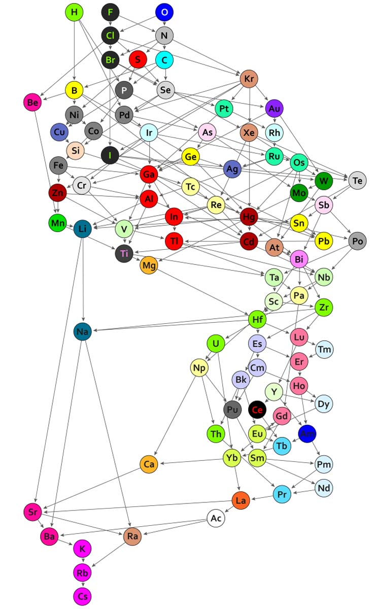
(Guillermo Restrepo, MPI for Mathematics in the Sciences)
As you can see, the debate about the perfect layout for the elements is still alive. For example, scientists do not always agree on where lanthanum and actinium should be placed. Although a spiral representation is way more pleasant to look at, practicality must rule over aesthetics, and the 18-column periodic table we are used to see is the most practical in terms of size and readability. However, as the number of elements increases (118 and counting…), a new design may soon become a necessity.